Fluid Geometry is the Key
October 10, 2017
A look at the top trends that will rule the world of interiors in 2017 and some of the reasons that will drive their preference
The top trends that will rule the world of interiors in 2016 are as follows: The 1950s and 1970s hot trends are back in fashion design collections. Mid-century mod with brass, gold and metallic finishes are in vogue, currently. Get ready to embrace some retro bling.
Decorative backsplashes have gone strong for a long time. Designers are expecting to see consumers gravitating towards more geometric patterns that feature fluid movement. Cement and even wood are going to play a significant role in achieving this. Whether it is a backsplash, an intricately patterned floor or a countertop, fluid geometry is coming in strong.
Industrial look office with more comfortable feel and bright colours with loads of decal and ambient lighting is the latest trend in the market. This trend is going to get bigger in the coming year. Organic shapes and textures will rule the roost in 2016. How can one incorporate these trends around the house?
Forget the matching look
Decorate a room with different furniture styles, colours and patterns. This gives a fashionable look and makes the room feel fresh. Refurbish an antique décor furniture, say for example one may pick-up an antique corner table and give it a distress look with the help of metallic paint to make it more appealing.
Use contrast and texture
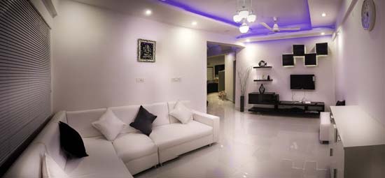
While a bright purple on one wall might look striking, you need to assess whether it works well with the décor in the rest of the room. Seamless transitions play on tones and pick up elements of design and décor. Use texture for more effect and keep contrasts muted unless you are trying to create a particular theme, like the rising sun, the morning twilight and the young trees all ready to bloom are equated with the freshness and purity in just being a child. Such kinds of themes reveal the simplicity and innocence of just being there.
Feature walls
You can use it to define a space in an open plan, focus on an element like a niche, entrance, fireplace or the wall behind a wall mounted LCD. Rather than a single swathe in a bright colour you may want to consider wallpaper, stencils or textured finishes.
The flexible curve
There are certain areas of the home that allow the creativity a bigger canvas. The powder room, kids’ room and staircase hold sway here, followed by corridors, kitchen backsplashes and entry rooms.
Wonderful faux
Colourwash in tones of beige, stripes in pale yellows, combing techniques in muted gold and sponged tones of khaki, all very subtle but can make a wall come alive and yet not become too overbearing. Get low on contrast and high on tonal variations. If you are feeling adventurous you may want to consider metallic bronze, leather finish or a natural crackle. When using the deeper colours like blue, orange, green and red you need to focus whether you can merge it with the décor in the room.
Mural magic
Not just restricted to kids’ rooms, murals can be used effectively in niches and walls to create an illusion of space and light. Murals are best left to professional artists. As kids of all ages love themes. Such kind of themes will help you to decide on how to design the room and consider things your child has shown an enduring interest in.
Remember the fun factor. Whatever the purpose of a child’s room, fun should be an universal ingredient. You can infuse fun in a room in many ways, from creating a video game centre for lounge rooms to choosing colourful texturally appealing carpeting for a bedroom. A touch of whimsy, such as a swing hung from the ceiling or a wall mural of your child’s favourite cartoon character can produce smiles every time the kid sees them.
To Know about Real Estate Projects in ThaneContact Us at 022 2580 6868
Source: dnaindia.com


